New maps for old to see the world as it really is
The Equal Earth map reclaims geographic truth, correcting the Eurocentric distortions of Mercator’s legacy by showing Africa’s true scale and restoring balance to global perspectives.

T he other day, I chanced upon a world map drawn by The Continent newspaper, a digital outlet that is produced by African reporters, photographers, illustrators and editors.
It was fascinating because, in the words of The Continent’s publisher, it was “based on the Equal Earth projection, which tries to solve that problem where Africa always ends up looking smaller than it is.”
True.
Not just Africa, of course.
Several countries in Asia, Africa, and South America are greatly diminished in the Mercator projection, the most commonly used world map.
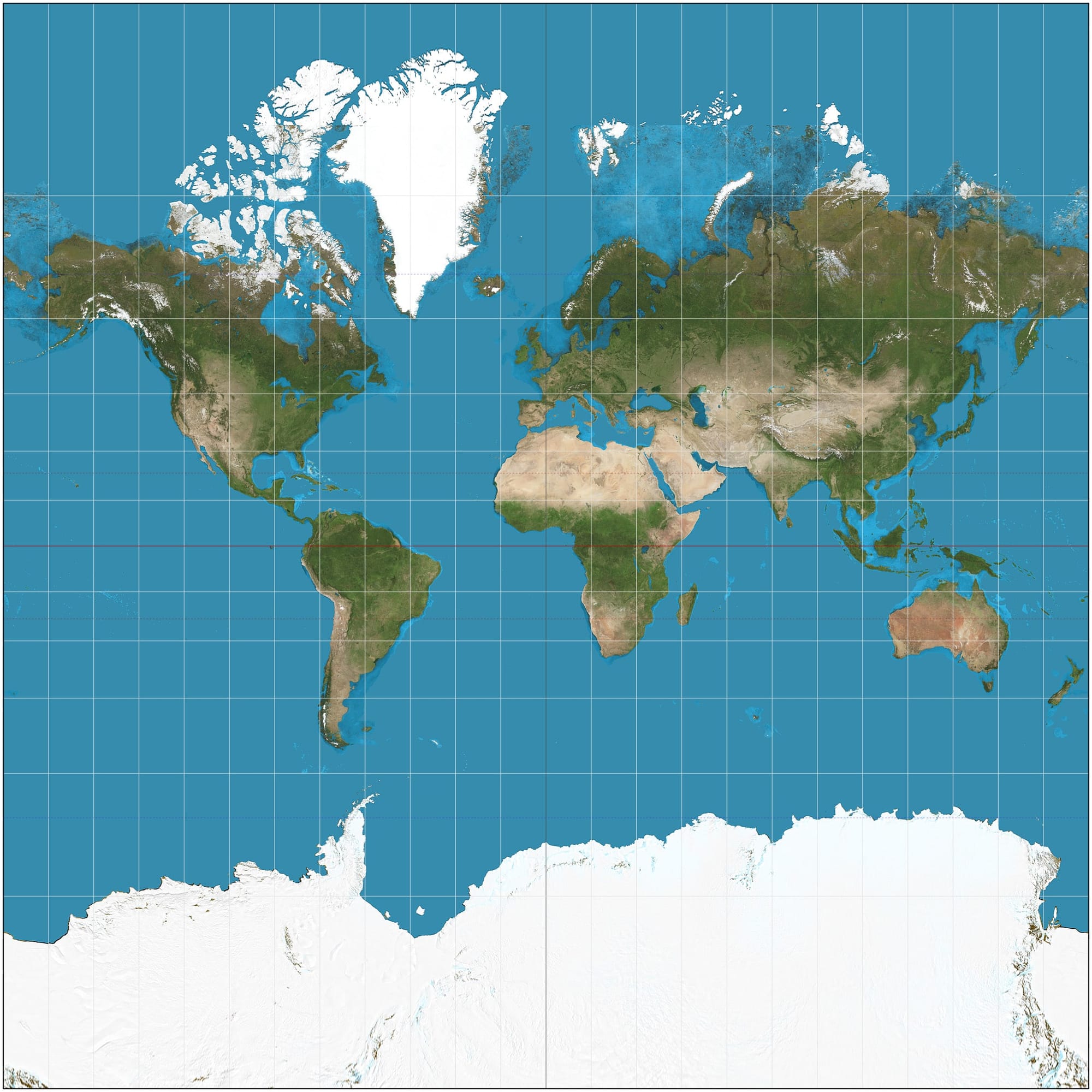
— The world on Mercator projection between 85°3'4"S and 85°3'4"N, such that image is square.
This is often seen as a deliberate slight, but there are complex historical reasons Mercator looks the way it does, with Western countries appearing larger than they are.
When Flemish geographer Gerardus Mercator designed the projection in 1569, it was a boon to navigators. Preserving the shapes of the different countries (while changing their size) made it possible to accurately calculate compass bearings. Apparently, navigators couldn’t work with the so-called line of true direction. Instead, they needed a line of constant direction, which crosses every meridian at the same angle, meaning the navigators can be sure of getting to their destination so long as they kept a constant compass heading (30 degrees or whatever).
So, the Mercator projection was great for seafarers in a previous age, but not for anyone interested in geopolitical issues today.
How valid is the Mercator projection today, anyway, with GPS and other tools available?
Its inaccurate depiction of countries often hits hard. Remember, countries, like people, do that egotistical thing of measuring how big and important they appear.
So do continents.
Mercator changes the size of countries and continents so much that Greenland appears larger than Africa. That’s despite Africa being 14 times bigger!
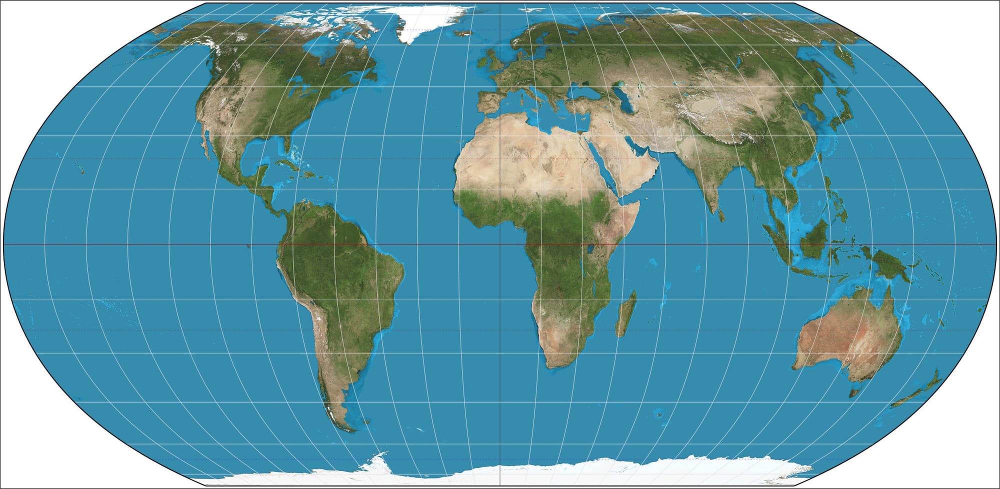
— Equal Earth projection. 15° graticule.
A better sense of how big and small countries really are is to depict them by area. That’s what the new map from The Continent has done, using the 2018 Equal Earth projection. It retains the relative size of areas, and that’s all to the good.

GOING FURTHER
Mercator Projection | BRITANNICA
Equal Earth Projection | EQUAL-EARTH
Sources:
▪ This piece was first published in Medium and re-published in Europeans TODAY on 5 June 2025 under a Creative Commons Attribution-NonCommercial 4.0 International licence. | The author writes in a personal capacity.
▪ Cover: AI-Generated image.